
Key Takeaways
- Small neon designs add personality through shape, colour, wording without crowding walls.
- Short phrases plus simple icons keep layouts readable, avoiding clutter in compact rooms.
- Careful spacing plus proportion help each neon piece stand out while blending into décor.
- Colour choice sets mood, with softer tones calming spaces, brighter shades adding energy.
Introduction
Walk into a room with a blank wall, add a small glow, and the mood shifts almost immediately. A thin line of light can introduce character without filling the space or drawing too much attention. Design choices carry stronger impact compared with size when working with neon signs, since shape, wording, plus colour determine how the piece blends in or stands out. Small details decide whether the glow feels natural or out of place, so each choice needs to sit well alongside the rest of the room.
Designing Words for a Personal Feel
Short Phrases Without Forced Wording
Choose wording that sounds natural when spoken aloud. Longer quotes tend to weigh down smaller pieces, while short phrases sit comfortably and read faster. One word or a brief phrase can express personality when using neon signs, without turning the wall into a distraction.
Letter Styles Changing the Mood
Focus on how lettering appears rather than only the message itself. Rounded scripts bring a softer look, sharper fonts introduce a firmer edge. Stroke thickness is adjusted by designers working on signboards in Singapore so smaller pieces remain readable while keeping proportions clear. Small shifts in lettering style can change how the entire room feels.
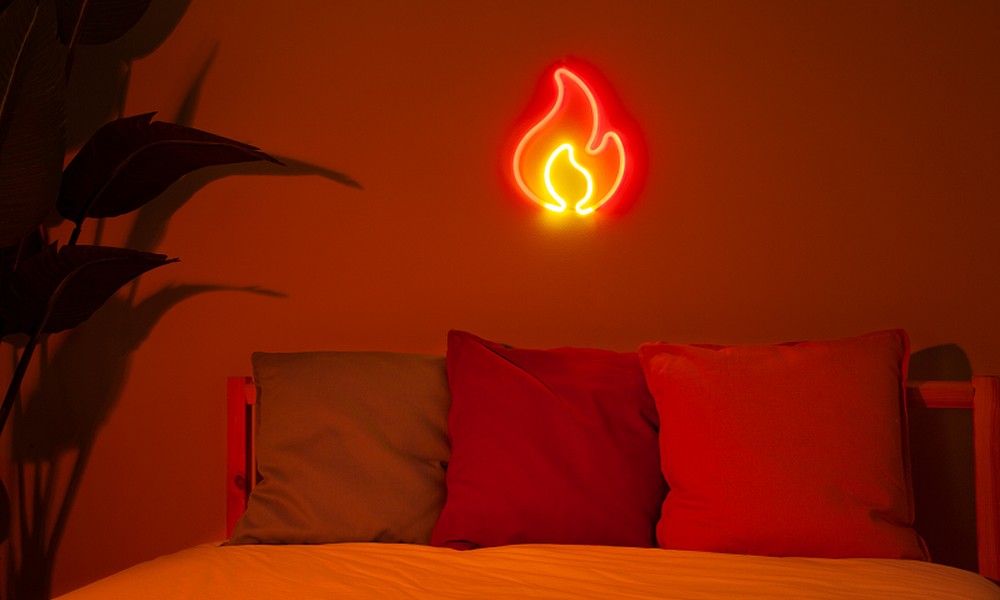
Using Shapes to Add Character Without Noise
Simple Icons with Meaning
Shapes can express mood without relying on text. A star, wave, or simple outline can carry meaning in a quiet way. Built around these forms, neon signs stay visually light, making them easier to place in tighter areas without crowding the surroundings.
Clean Line Designs
Outline-based designs give a crisp, controlled look. Thin neon lines define shapes without adding bulk, fitting compact areas easily. Minimal layouts rely on this approach; designers for signboards in Singapore apply it to keep text readable and layouts uncluttered.
Colour Choices for the Right Tone
Soft Colours for a Quiet Glow
Colour choice affects how a space feels once the light is switched on. Muted pinks, warm amber, or soft white tones create a calm glow that sits comfortably in a room. In these shades, neon signs remain present without pulling too much focus.
Strong Colours for Extra Energy
Brighter tones work best in smaller doses. Electric blue or neon green can lift a dull section without needing a large display. Placement plays a role here, since a compact piece with bold colour benefits from open space around it.
Keeping the Design Balanced in Small Spaces
Size Matching the Layout
Proportion plays a key role in how the sign fits into the room. Smaller pieces tend to settle naturally near furniture or shelving when neon signs are used in compact layouts. Larger pieces can crowd the setup, while compact designs keep the layout clean and easy to read.
Spacing Letting the Design Stand Out
Open space around the sign helps the design stay clear. Surrounding it with too many items reduces visibility and breaks the effect. The same idea is followed by signboards in Singapore, where spacing keeps each element distinct and easy to recognise.
Conclusion
A small neon piece works best when design choices feel deliberate. Wording, shape, colour, plus placement all contribute to how the final look comes together. Careful decisions keep the sign expressive without overwhelming the space. A well-placed design blends into daily use, creating a visual point that feels easy to live with over time.
Contact My First Sign today and create a neon design that fits your room, your style, and your layout without overwhelming the space.